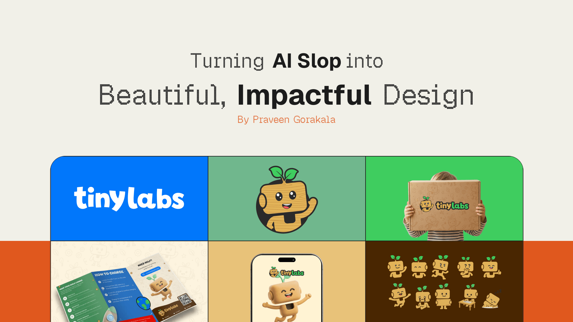
In two days I finished a complete brand identity for Tinylabs — a kids' STEM toy brand. Logo system, mascot with a full expression sheet, colour system with Pantone values, two-typeface system, 3D icon set, product engraving artwork, a printed product manual, packaging and a live brand guidelines site with downloadable vector assets.
Two days. All of it.
Now before you think this is some magic, let me be clear. It is not. What changed is only the execution time. The thinking part took the same time it always takes.
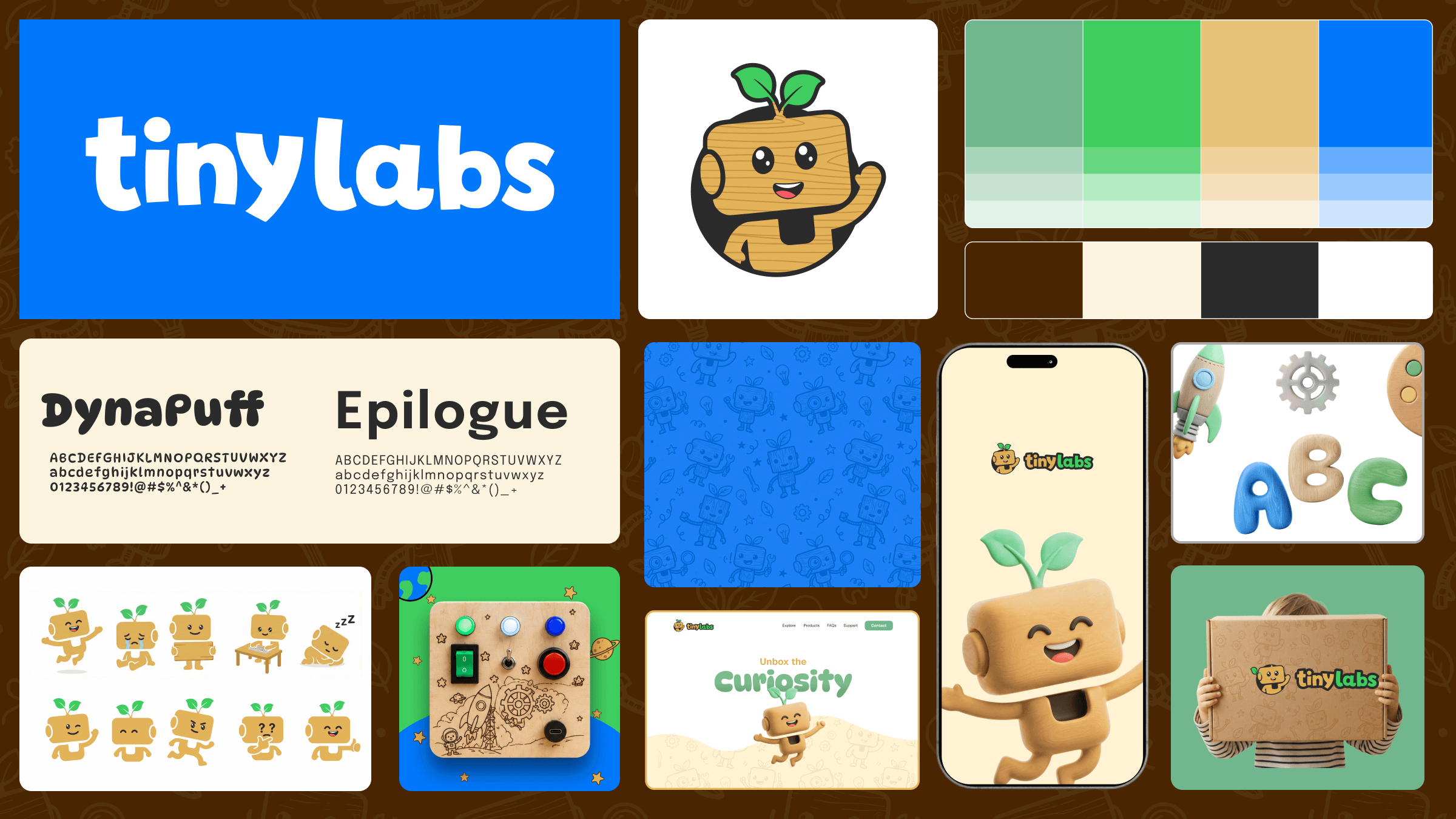
The finished Tinylabs identity — logo system, mascot, colours and packaging. None of this came directly out of a prompt.
"Slop" is not a bad word. It is just raw material.
By now everyone has seen it. That AI poster with nice lighting but the headline text is broken. The logo that looks premium until you see the letters are not matching. The layout that has a mood but no order.
That is slop. And I am using it daily.
Because slop is not a finished product. It is raw material. Nobody sees a marble block and says it is a failed statue, no? AI gives you volume, direction and texture very fast. Faster than any moodboarding you can do manually. What it cannot give you is judgement.
People who are getting bad results from AI are not prompting wrongly. They are treating the output as the final delivery instead of treating it as input.
It started on paper
Before ChatGPT, before Figma, there was a pencil and a ruled notebook.
I sketched the mark by hand. Then I sat and worked out the construction — a 90 × 90 grid, the head at 46 units, the leaf stems at 11, the ear at 7, the eye positions measured out. Boring work. Nobody sees it in the final logo. But this is what makes a mark reproducible instead of just a nice drawing.
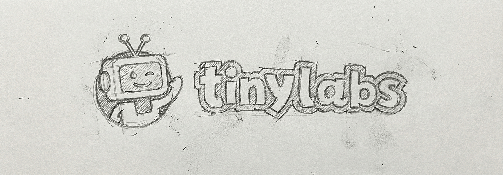
The construction page. Head at 46 units, leaf stems at 11, ear at 7. Nobody sees this in the final logo, but this is what makes the mark repeatable.
Along with this, the palette was locked before any generation happened. Bio-Logic Green, Sage Green, Timber Gold, Energy Stream Blue, with Walnut Brown, Graphite Black and White as supportive. Hex, RGB, CMYK, Pantone. All fixed.
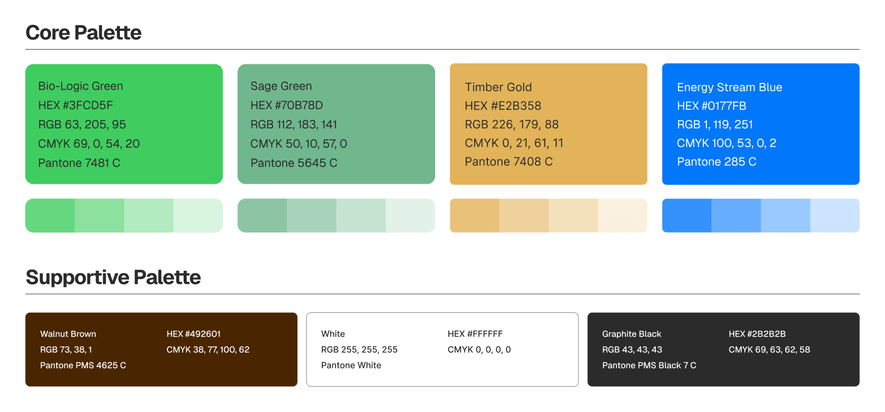
The palette, locked before any generation happened. Hex, RGB, CMYK and Pantone for each.
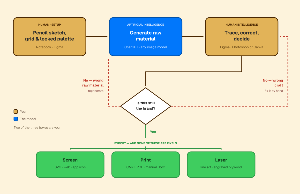
The pipeline. Note where it starts, note the loop back, and note that nothing ships as pixels.
Only after this, AI came into the picture. And I was not asking it to create a brand. I was asking it to extend a brand that already had a backbone.
That flip is everything. If you ask AI for an identity, you will get slop with no centre. If you give AI an identity and ask it to explore applications, you will get hundred usable directions in twenty minutes.
What happened when I gave AI the colours
This is my favourite part, because it shows the problem so clearly.
I gave the palette and the brief to AI. And it produced a complete brand sheet. Logo lockups, colour system, typography, icon pack, seamless pattern, packaging mockups, business cards, poster, even art direction photography. It looks organised. It looks professional. At thumbnail size you would say the work is done.
But look at the mascot. It is a green and white television robot with antennae. My brand's mascot is a wooden block character with two leaves growing out of its head.
They are not the same brand. They are not even close.
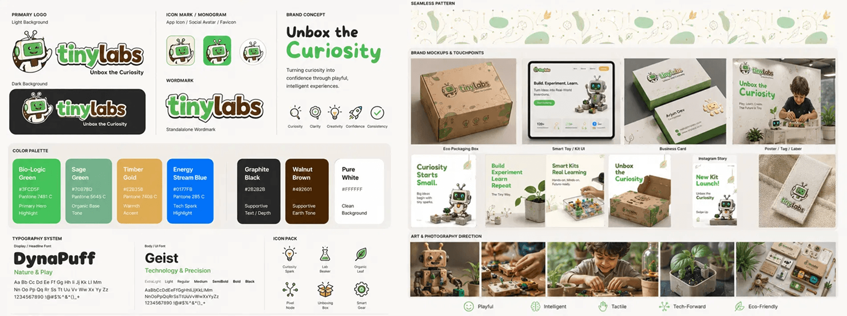
AI's version. Every section a brand sheet is supposed to have — and the wrong mascot in all of them.
This is what slop actually looks like. Not broken and ugly. Confident and wrong. That is far more dangerous, because a person without design training will look at this sheet and think it is finished. It has everything a brand sheet is supposed to have. It just does not have the brand.
So what did I take from it? The layout logic of a spec sheet. Some pattern directions. A few packaging composition ideas. Maybe fifteen percent of it was useful.
And that fifteen percent was still worth it. Reacting is faster than starting. A designer looking at six average layouts will find the right answer faster than a designer staring at an empty artboard.
Now the hands come in, and everything becomes vector
Everything AI gave me came as pixels. Everything I shipped is vector. That sentence is the whole workflow.
- The mascot. AI helped me explore poses and expressions — jumping, crying, sleeping, thinking, running, waving, thumbs up. Ten in total. But generated characters drift. The head proportion changes between poses, the leaf angle changes, the eye size changes. So every single one was rebuilt in Figma against the construction grid from that notebook page. Now the character is actually the same character in all ten poses.
- The icon pack. Rocket, ABC blocks, palette, gear — rendered as 3D wooden objects. AI is genuinely good at this and I did not fight it. But they went into the system as clean cutouts with consistent lighting direction and consistent scale, not as ten random renders.
- The type system. DynaPuff for display, Geist for body. Chosen, not generated. DynaPuff gives the nature and play half, Geist gives the technology and precision half. A kids' STEM brand has to speak to the child and to the parent at the same time, and one typeface cannot do both.
- The logo files. SVG and PDF, light and dark versions, full lockup, icon only, wordmark only. Anybody can download them from the brand site right now and drop them into anything at any size. This is exactly the difference — AI gave me the shape, but shape at one fixed size is not an asset. Vector is the asset.
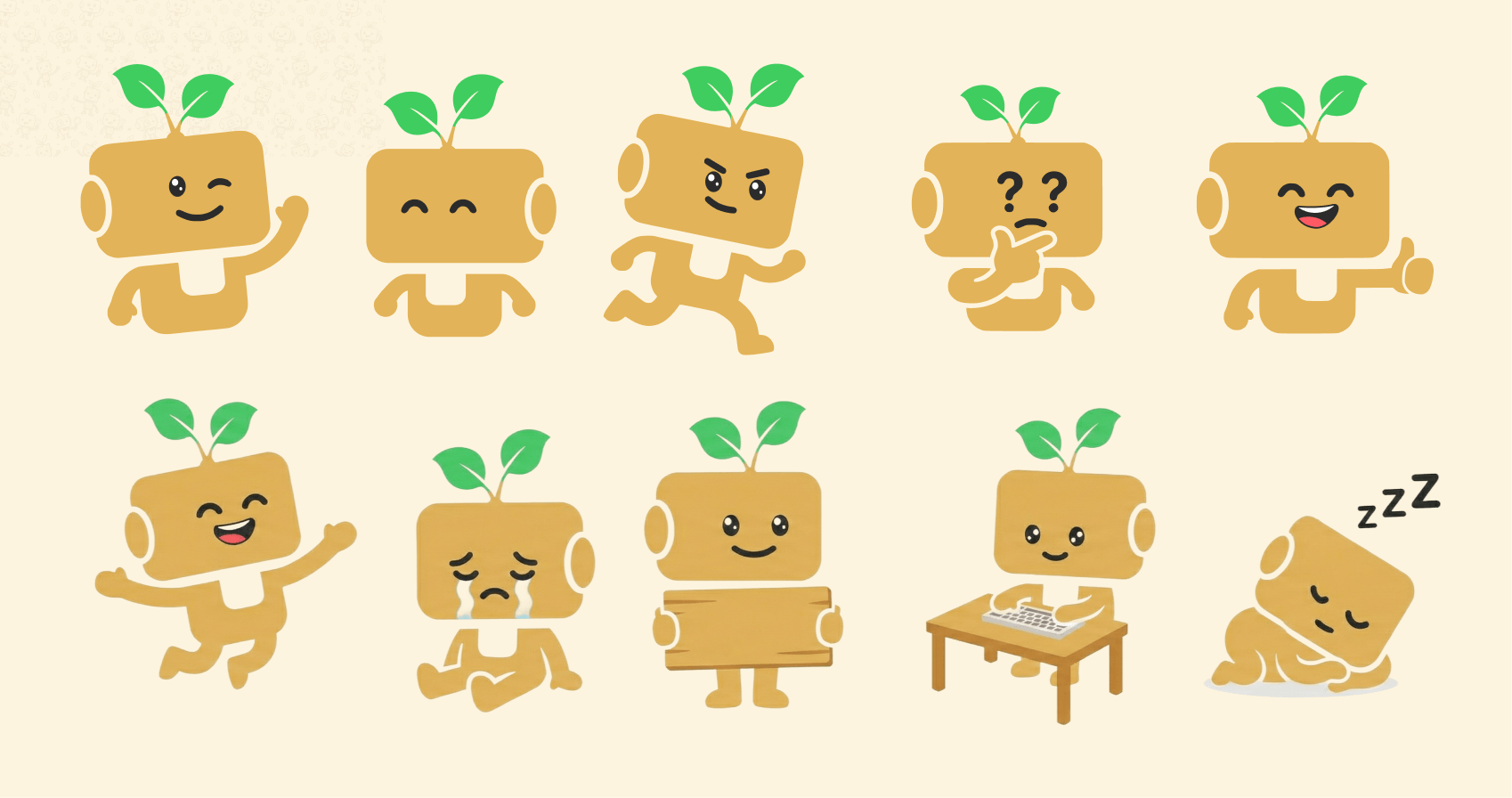
Ten poses. Keeping it the same character across all ten is the part AI could not do.
From a rendered concept to an actual wooden product
This is the sequence I am most happy with.
AI generated a busy board concept — a space scene, rocket, gears, an astronaut, planets. Nice illustration. Completely unusable as it was, because it was a colourful raster image and the actual product needed single line artwork for a laser to burn into plywood.
So the illustration was redrawn as clean line art, sized to the real board, positioned around where the physical switches and buttons would sit. Then it was cut.
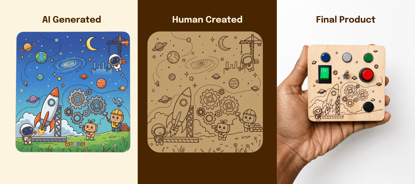
Concept, engraving artwork, and the real thing. Three completely different files.
The third picture in that row is a real object sitting on a real table. AI cannot make that. It can only help you decide what to make.
Decorated vs designed: the two manuals
The product needed a printed manual — how to play, how to charge, what the child learns, how to contact support.
AI gave me a version first. Four rounded cards, numbered, with icons for each action — a switch icon, a button icon, a plug icon, a little astronaut in the corner. It looks like a manual. Layout is neat, colours are on brand, hierarchy is fine.
But look closely at what those icons are. They are generic. A drawing of a switch. A drawing of a button. It is a manual for the idea of a busy board, not for this busy board.
And in the "Need help" panel, AI left a dotted line where the email address should go. It built a manual shaped object and left out the single piece of information a manual exists to deliver.

AI's manual. Neat, on brand, generic — and no email address.
So the human version replaced every icon with a photograph of the actual product. The actual toggle switch on the actual plywood. The actual green rocker. The actual red button. The actual USB-C port. And a real photo of a child's hands holding the board.
Same information. Completely different level of trust. A parent opening that box sees the exact thing they are holding.
The other changes are less visible but matter more for print. The four floating cards became proper fold panels running edge to edge, because that is what a printer actually needs. Colour blocks go full bleed instead of sitting inside white gutters. The generic clip art was swapped for the brand's own 3D assets — the rocket, the earth, the mascot. And the email address is filled in.
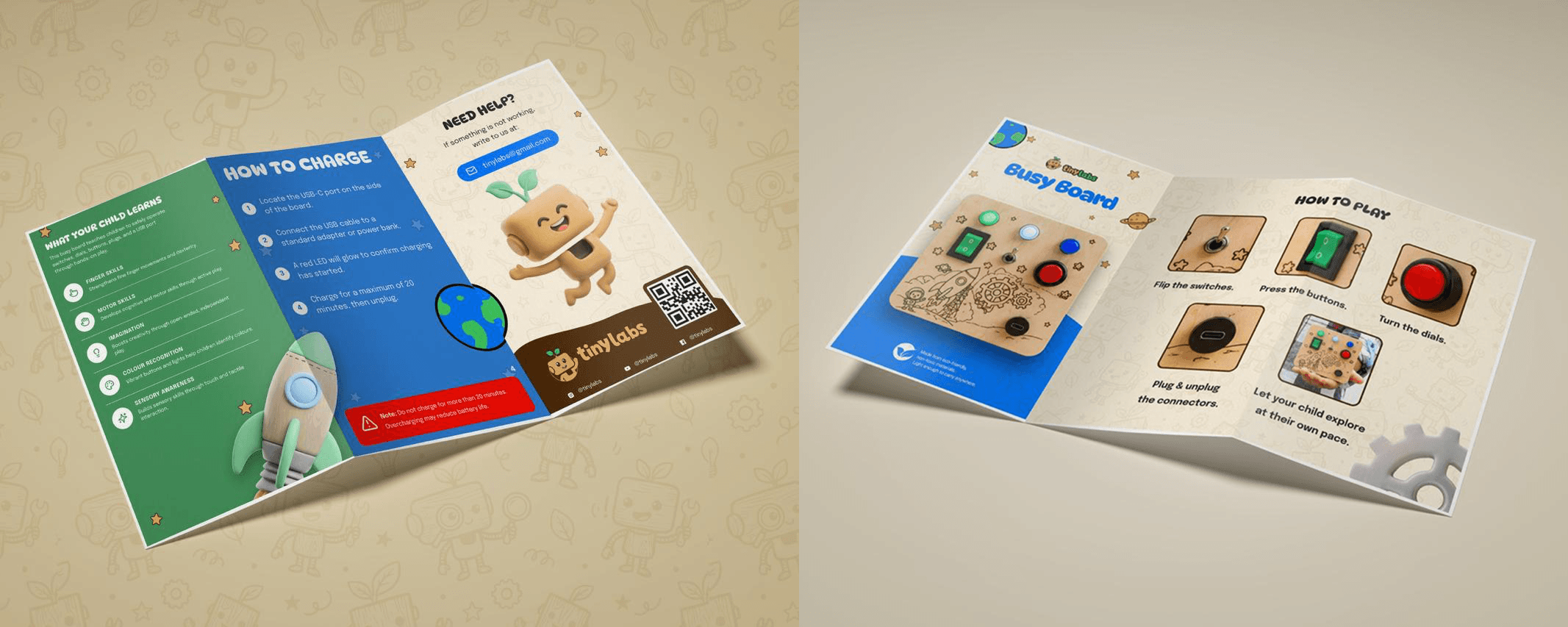
The version that went to print. Every icon replaced with a photo of the actual product.
AI is very good at making things that look nice. Hierarchy — deciding what a person should see first, second, third — that is a decision. And decisions are still ours.
Now the honest part
Two things I want to say plainly, because most posts on this topic will not say it.
You do not need expensive software. I use Photoshop, but it is roughly ₹1,700 a month and for a small studio that is a real cost. Canva Pro handles background removal and basic manipulation well enough for this workflow, at a fraction of that. The vector work has to happen in Figma, and Figma's free tier is enough to start.
Resolution has a limit, and print is where it bites you. On a ₹399 per month plan you are not getting print grade output. This does not matter if you use AI where I use it — exploration, texture, mockup. It matters enormously the moment something has to go to a printer or a laser cutter. The Tinylabs manual is CMYK. The logo is vector. The engraving artwork is line art. None of that came out of an image model, and none of it could have.
And be careful with generated product images. Mockups are fine — the Instagram grid I made for Tinylabs is a concept mockup, and the follower count on it is invented. That is fine for showing what a feed could look like. But the moment it is a real shop page, the product images have to be photographs of the real product. If a parent orders a busy board that does not match the picture, that is a customer problem, not a design problem.
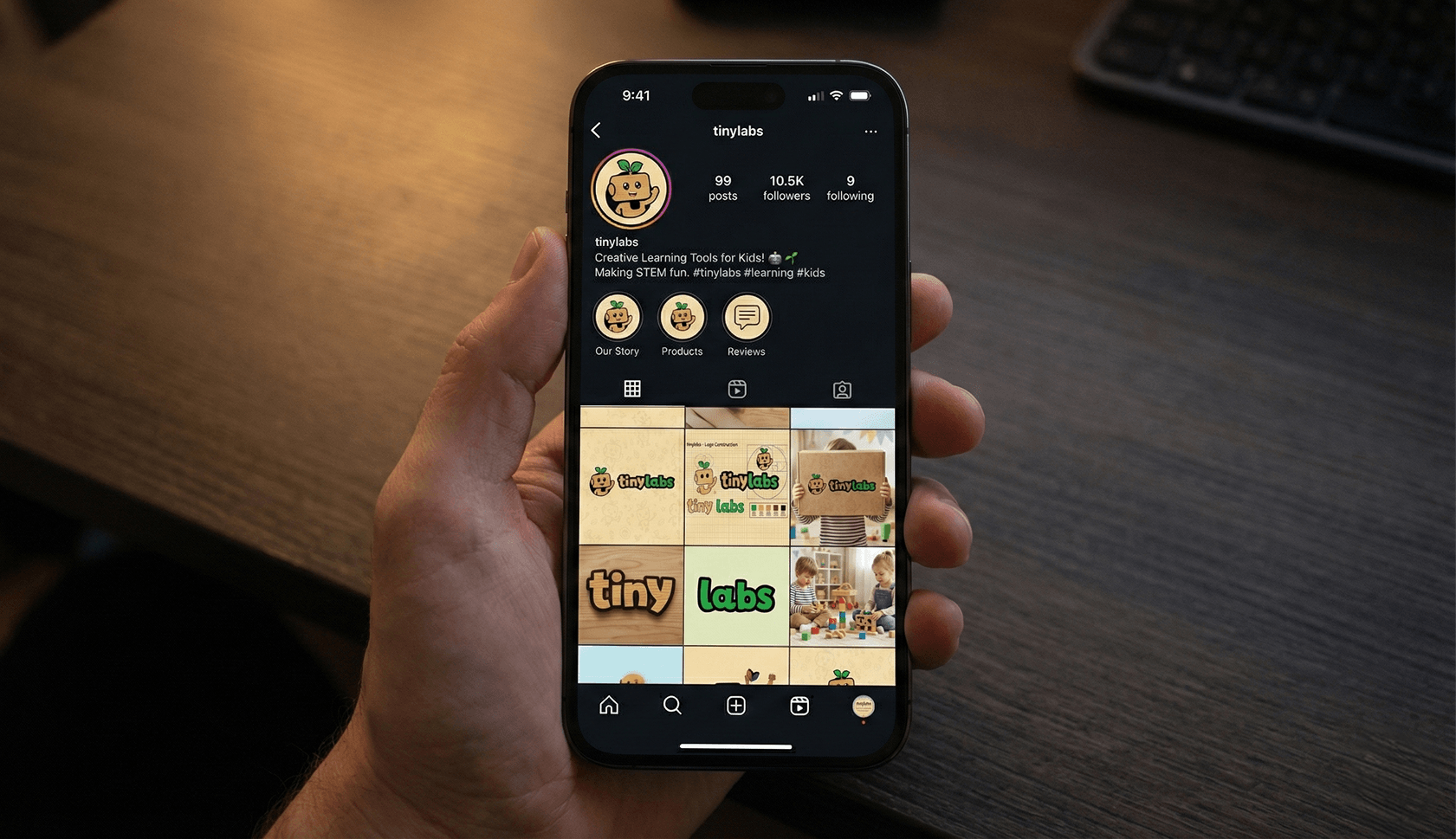
Concept mockup. The follower count on it is invented.
So what does all this mean?
If you are a designer: your execution time is going to collapse, and your judgement is going to become the entire job. Look at that AI brand sheet again. It had everything except the actual brand. Knowing that — knowing what is wrong with something that looks right — is the skill. That part was always the valuable part, and now it is the only scarce part. Learn the tools. They are not coming for the thing you are actually good at.
If you are a small business owner: you can now get a proper identity in days instead of months, and for much less money. But be careful who you hire. A person with taste using AI will give you something excellent. A person without taste using AI will give you a very confident, very complete brand sheet for a brand that is not yours, and you will not know until it is printed.
And for everybody: AI did not lower the barrier to good design. It removed the barrier to producing things, which is a completely different thing. The gap between someone with creative judgement and someone without it has become much wider now.
Tools have become cheap. The eye is still not.
Tinylabs brand guidelines and downloadable assets
Built using Figma, Photoshop and ChatGPT Go (₹399/month). Logo sketched by hand and built as vector.